
“Laughing has a contagious effect, it makes you feel good with your friends, even if you may not know them well. When you laugh, there are no barriers.”
Teenager during LEGO® Serious Play® activity
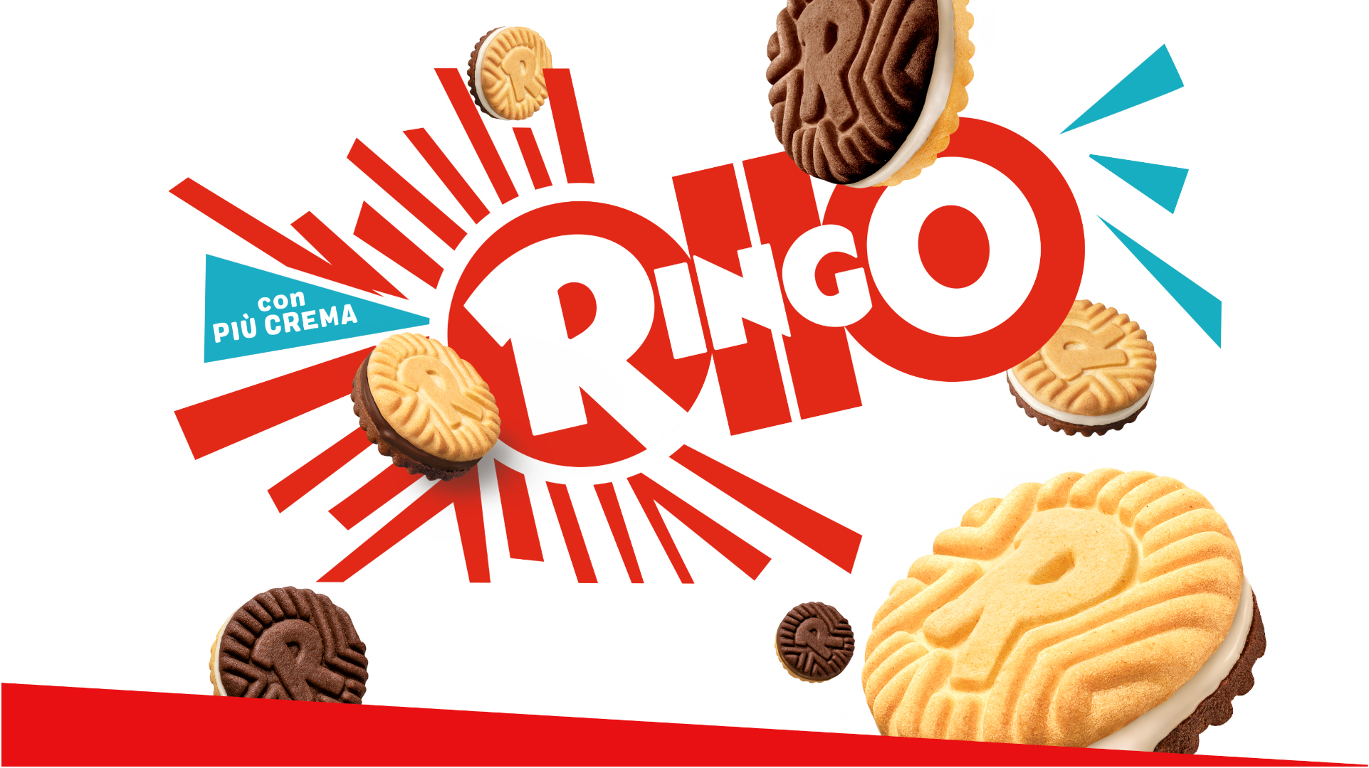
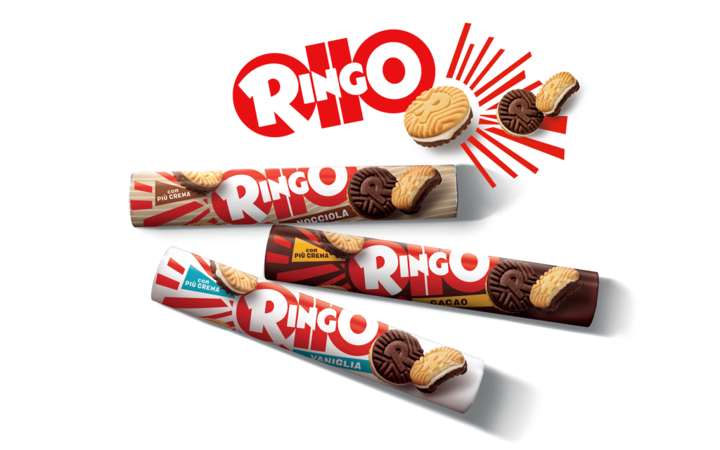
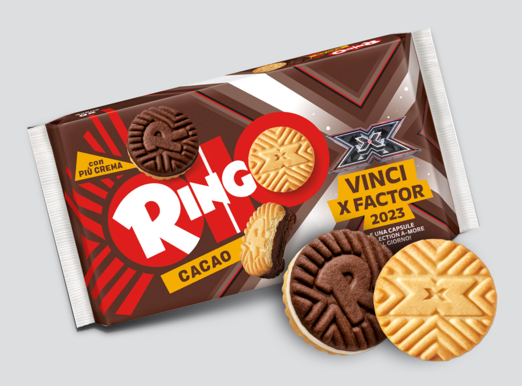
In the 1960s, Pavesi introduced Ringo, a sandwich biscuit that stood out for its innovative approach in the Italian snacking landscape. Ringo quickly became an iconic product and continues to lead its category today.
Throughout its history, Ringo has established a special connection with teenagers. The format, packaging, and especially the communication convey notions of positivity, sports, and friendship, making it a beloved product among young Italians.
Over time, the company has introduced various changes to the elements comprising the Ringo brand. However, in recent years, a need for a new strategic positioning that resonates with contemporary consumers has become apparent. This led Pavesi to kick off a 360° brand renewal, addressing every touchpoint – from product design to graphics to communication – with the aim of enhancing relevance and resonance with the current consumer base.
VRD was invited to launch the process with the redesign of the Ringo biscuit, marking the first strategic step to expand the experience, generate new design and language codes, and guarantee innovation for subsequent brand activation.
The approach
Redesigning Ringo meant not only reinterpreting its history, but, above all, condensing the key elements of the brand identity into the design of the biscuit itself, codifying how they should exist today and in the future.
We began by generating a matrix on which to weave innovation opportunities, balancing history, future vision, and company strategy linked to the product.
Next, we engaged in the analytical process, akin to unpacking and framing, to understand and interpret the steps and developments that had occurred over time. This helped us create a map of the codes to be reinterpreted and projected.
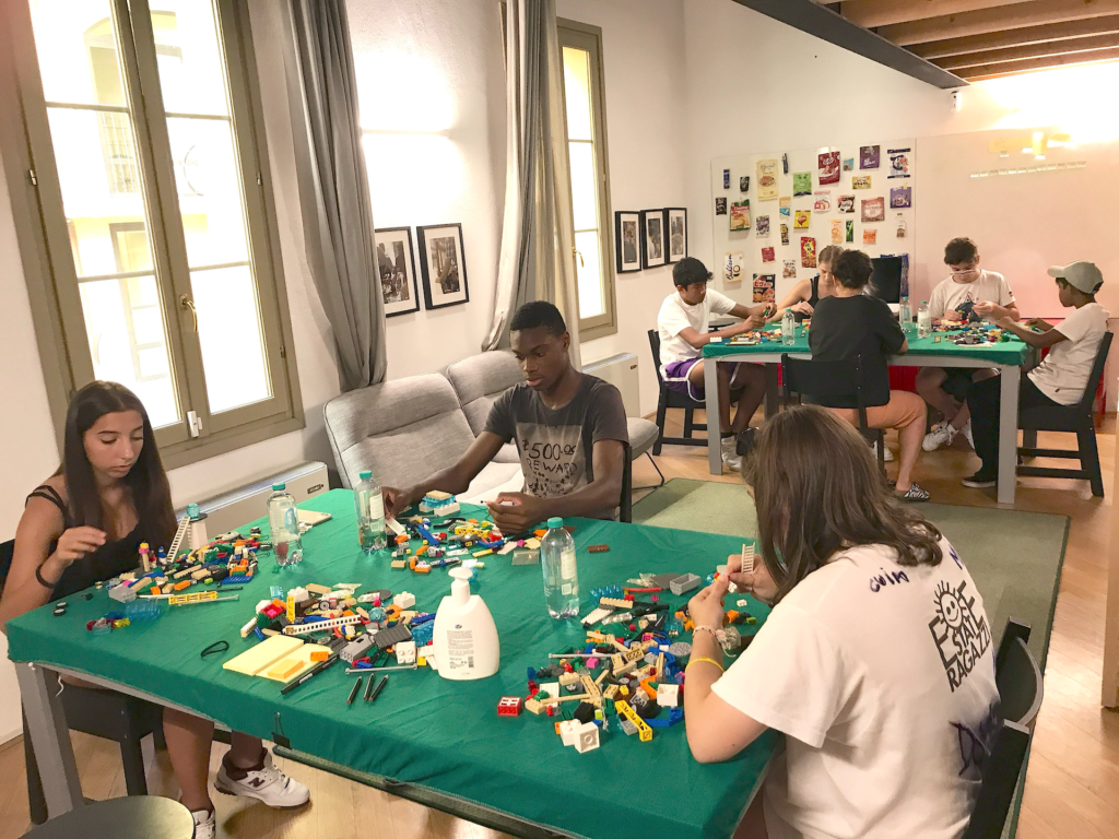
Finally, we turned to Ringo’s key audience, involving two groups of teenagers in the next phase to gain a deeper understanding of their lives, their values, and their desires, determining how the brand should evolve to reflect its consumer.
16 teenagers
involved during the
research process.
2 generations, 2 workshops
GenZ and GenAlfa were guided through specific activities in the focus groups.

From discoveries to translations
We held workshops with teenagers where we explored their views on interpersonal relationships, diversity, and integration. By examining and decoding their thinking, we identified concepts that could help shape the redesign, integrating metaphors, scenarios, and stories relevant for our key audience.
The key finding was that interaction and interpersonal relationships are the focal points around which today’s teenagers construct their own identity – relationships that go beyond diversity, to represent something vibrant, dynamic, and playful. We summarized this finding with the concept of resonance, and that became the central element for the new Ringo redesign.
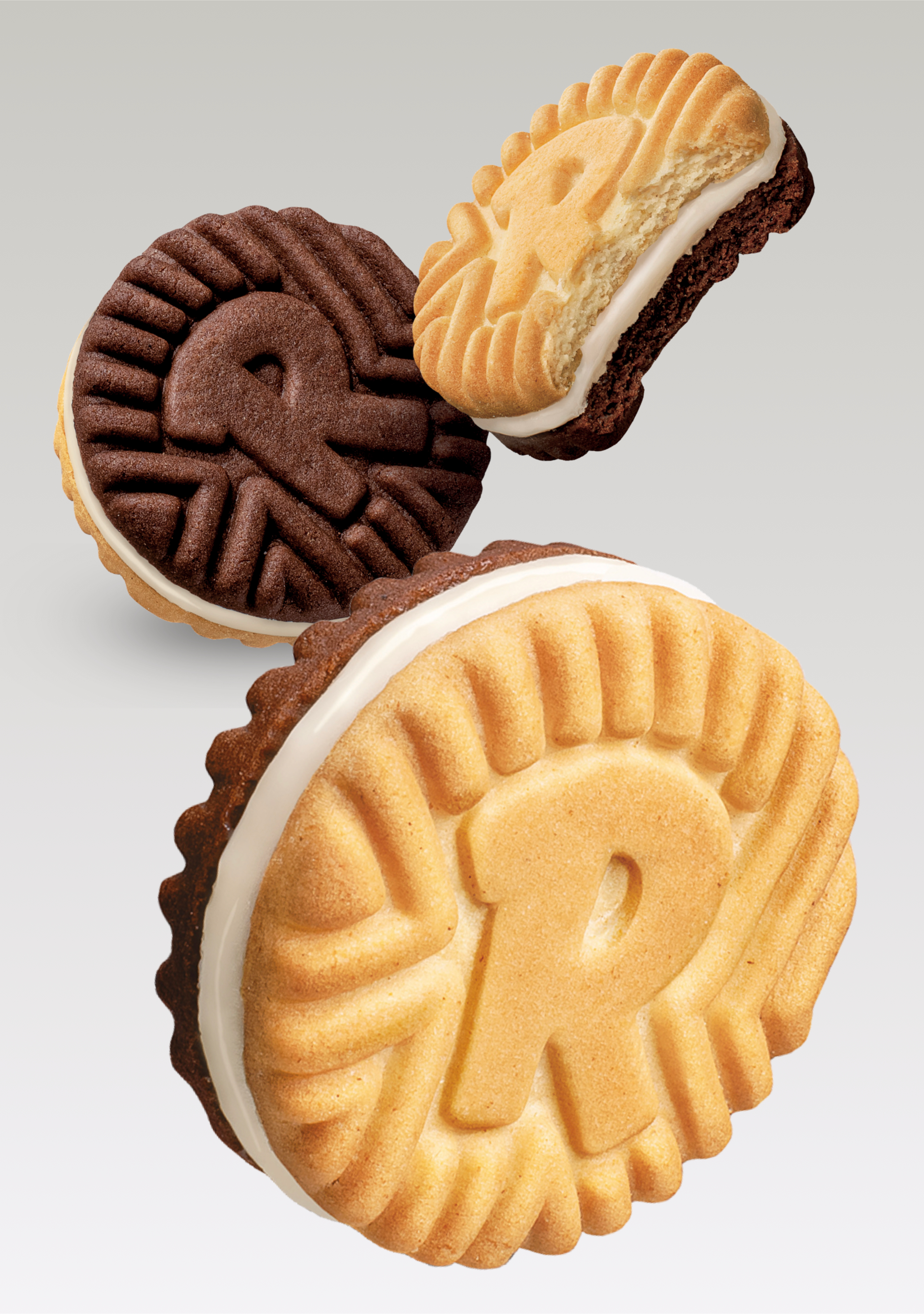
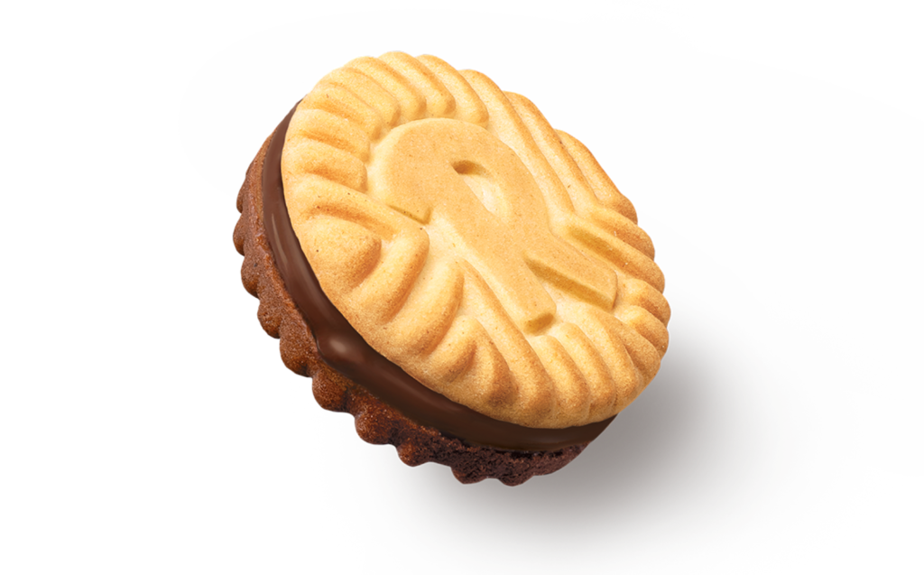
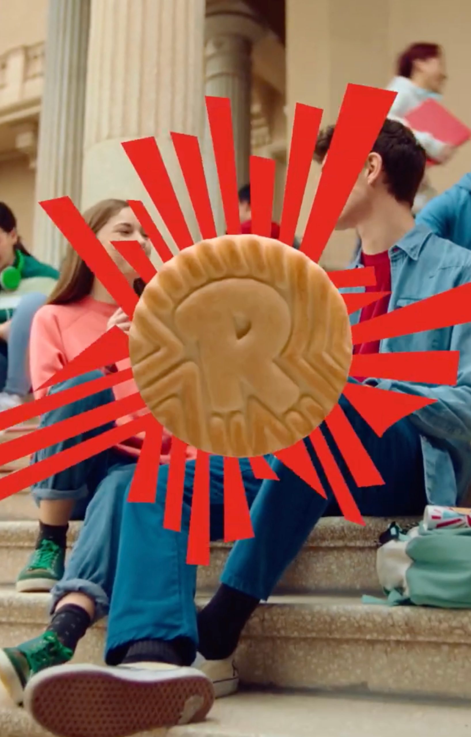
The Ringo ‘R’, historically a central element in brand communication, is ready to tell a new story. We embraced this challenge, decoding insights gained from our research. As a result, the ‘R’ transforms into a dynamic, vibrating, and expanding symbol, evolving into resonance itself. It projects the brand’s story into countless others yet to be lived and told.
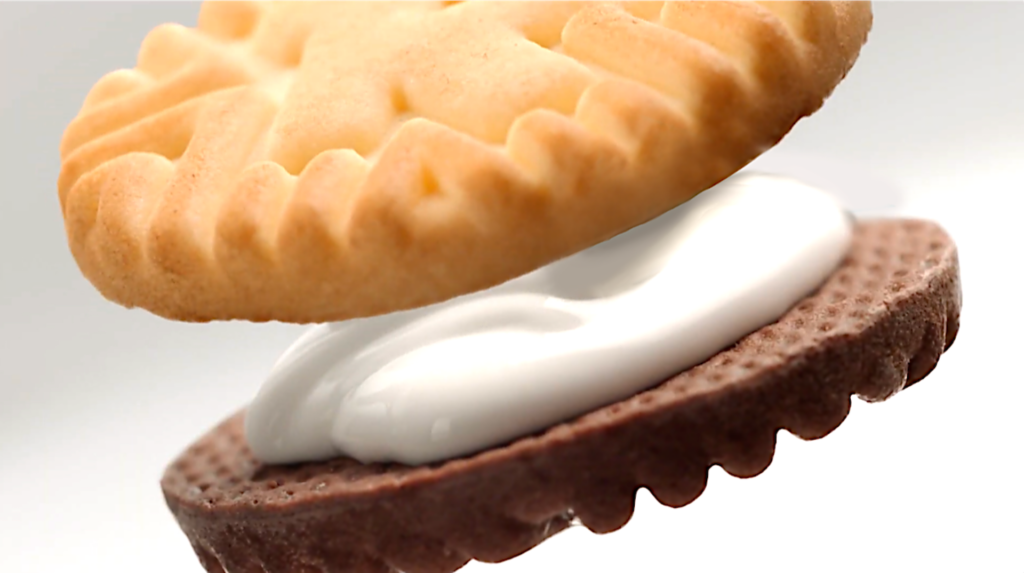
The waves emanating from the ‘R’ provide a means to extend the concept of resonance into three dimensions. The graphic becomes a sensory experience, where the lines serve as a stimulus for the taste buds, accentuating the crunchiness of the biscuit—a surprising texture that enhances the consumer experience. The ‘R’ resonates and expands, mirroring the actions of today’s teenagers, encapsulating their way of life within the product itself.
This formula, with its “urban” character that respects the original identity, but renews it for the modern marketplace, lent the perfect support to the development of the new Ringo tagline, “Unique Together.”
Key implemented actions:
- Final biscuit design
- Final production design, in accordance with R&D specifications
- Video concept presentation
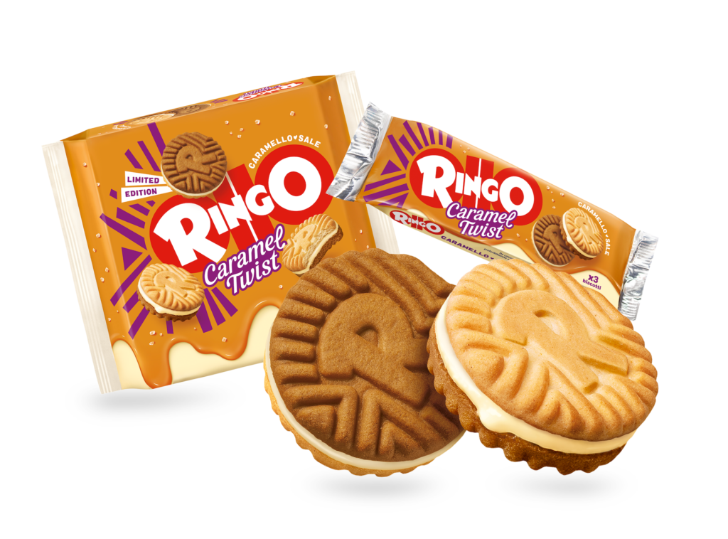
- Design for a special edition
- New product features including flavours extensions.