“The app is now so much clearer! The relevant information is there, but it’s better distributed than the old app, where you had to find information in folders within folders.”
App user, after seeing the project outcome

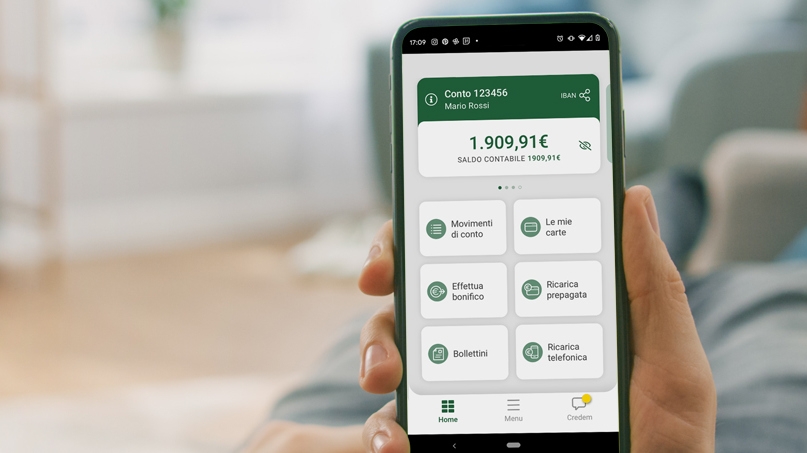
The goal of this project was to create the next evolution for Credem’s online banking experience. We drew inspiration from the bank’s history of building deeply personal relationships with its clientele, a legacy built over generations.
The story of Credem mirrors the journey of personalised banking. Over the years, the bank has distinguished itself by forging close ties with its customers. These relationships formed the foundation for this project; the aim was not merely to revamp an app, but to integrate the expectations and needs of customers into the core of the digital experience.
The approach
We adopted a unique design methodology, grounded in human-centric innovation, defining a tailor-made design process that focused on people and their relationship with Credem. This approach prioritised not just trends in the banking industry, but the people that create them: Credem’s users and stakeholders.
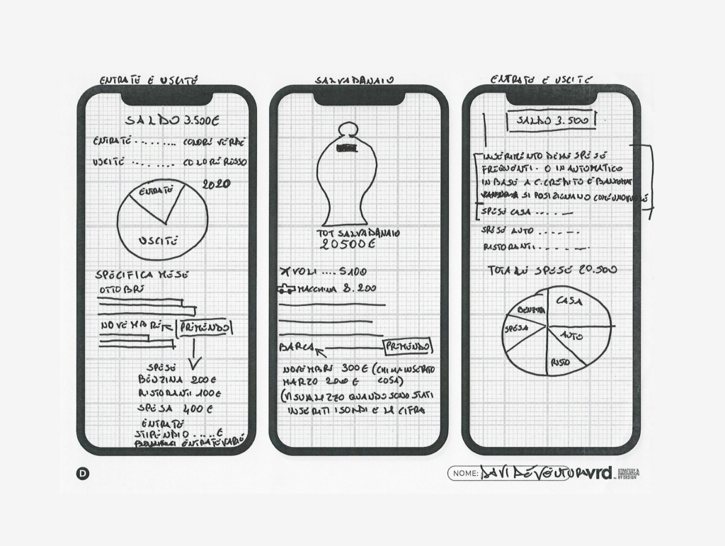
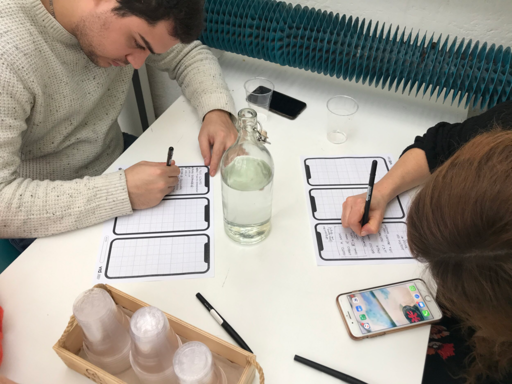
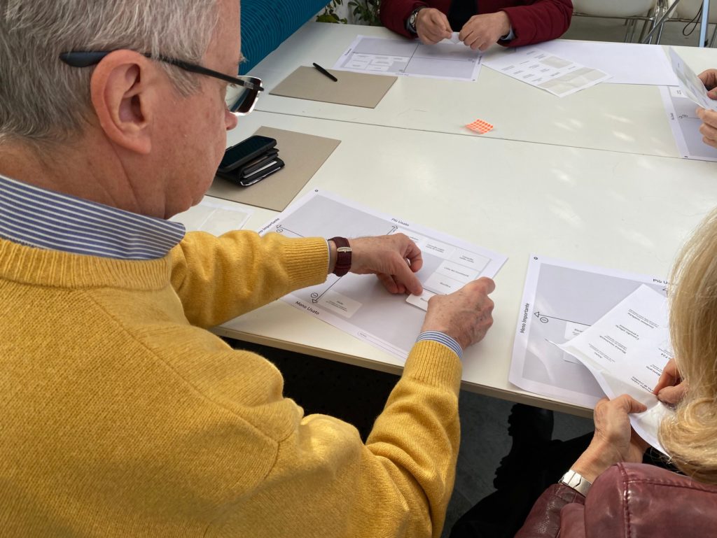
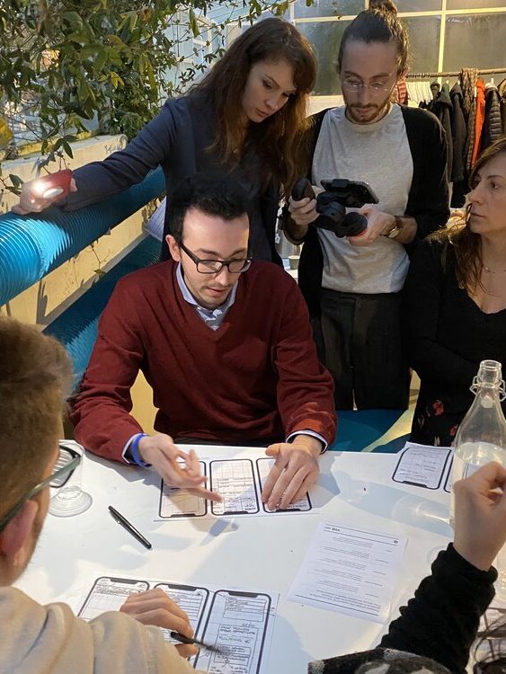
We gathered a diverse group of customers – people from different generations and backgrounds – and paid close attention to their wants and needs. We involved them at every level of the process, from high level brand discussions, to detailed UX testing.
Particular attention was given to the specific needs of users belonging to different generations, to strike the right balance between functionality and ease of use.
22 CREDEM consumers
WERE involved throughout
the entire process.
3 COLLABORATIVE WORKSHOPS
held with participants from
different age groups to identify
design principles.
9 design sprints
to develop and test
key elements of functionality.
12 INTERACTIVE prototypes
created for testing and
implementation.
From best guesses to informed decisions
Our continuous engagement with users provided deep insights into their evolving digital banking preferences. Through in-depth analysis, we identified potential areas for improvement and, in collaboration with a cross-functional team at Credem, designed a brand new interface, exploring new areas for innovation, and devising features that appeal to both current and future clients.
The phases of innovation involved co-creation, co- design, interactive prototypes, extensive user testing, design sprint, and development sprint support. This iterative process allowed us to constantly refine and perfect the insights, solutions, and strategies we had developed.
The result was an app, considered by all users, as beautiful, easy to use, safe, and easily adaptable for the future.
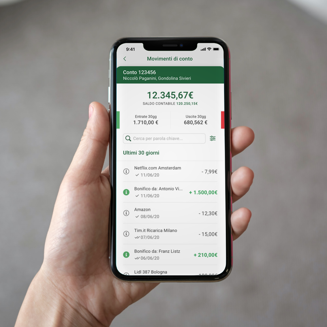

Key implemented actions:
- Information design and architecture
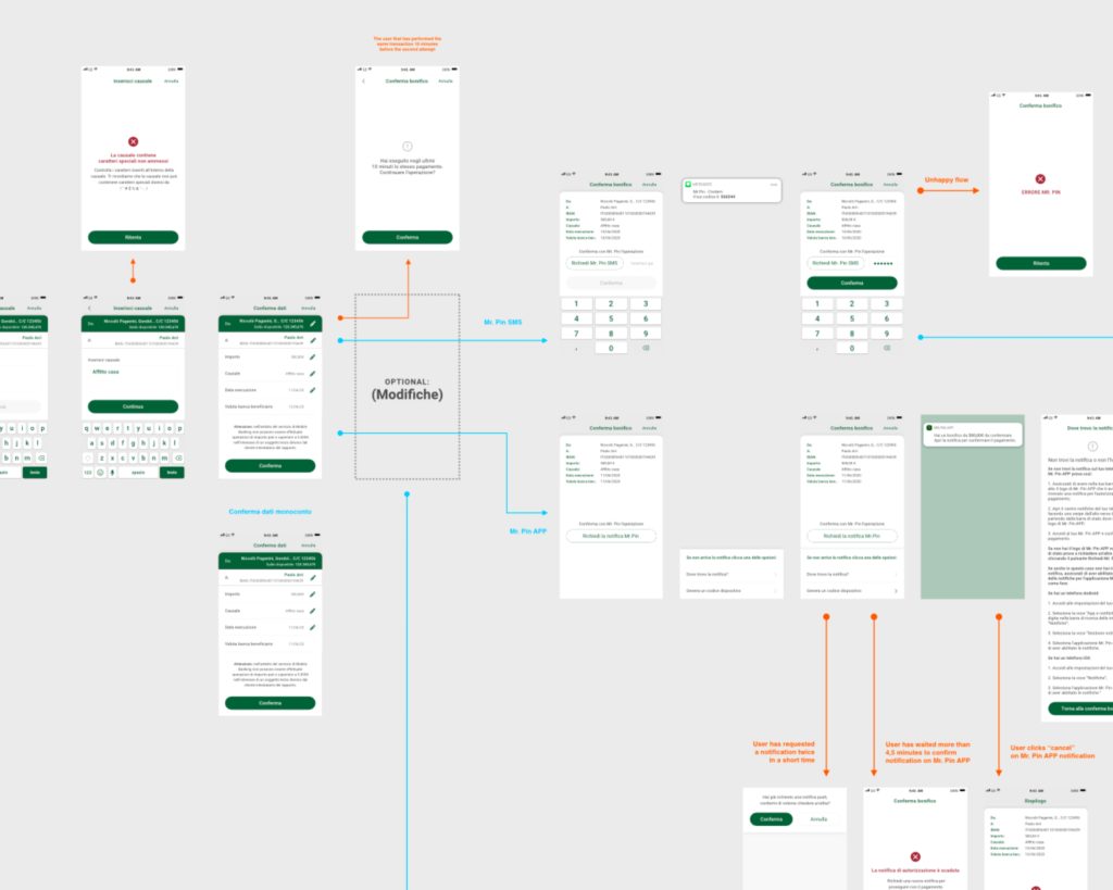
- Development of application flows to facilitate tasks
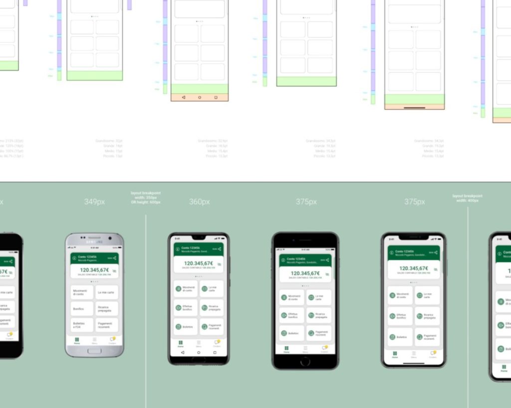
- Design of wireframes to enable interaction
- Visual design of the entire app
- Integration of user insights during implementation

Results after app launch:
- More than 450,000 customers are using the app, giving them access to enhanced financial management tools
- The app powered 30% annual growth in mobile app usage, with millions of digital transactions in 2021
- 93% of total transactions run on digital channels
- 45% growth in average daily login on the mobile app

